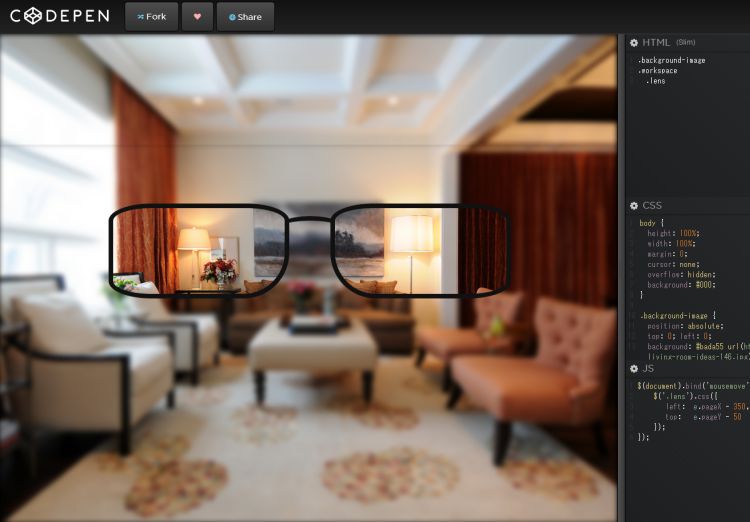
メガネのレンズがあるところだけクリアに画像が見えるCSSの画像フィルターblurを使ったアイディア
PR
CSSのblurを使ったメガネのレンズの部分をクリアに見せるアイディア
メガネを使えばこんなに綺麗見れますよっていう宣伝につかったり、メガネの部分を虫眼鏡にして遊べるWebサイトを作ったりと使えそうですね
– CODE –
HTML
<div class="background-image"></div><div class="workspace"><div class="lens"></div></div>
CSS
body {
 height: 100%;
 width: 100%;
 margin: 0;
 cursor: none;
 overflow: hidden;
 background: #000;
}

.background-image {
 position: absolute;
 top: 0; left: 0;
 background: #bada55 url(http://thehomesitter.com/wp-content/uploads/2013/12/small-apartment-living-room-ideas-146.jpg) no-repeat center center fixed;
 background-size: cover;
 height: 100%;
 width: 100%;
 filter: blur(5px);
 -webkit-filter: blur(5px);
 z-index: 1;
}

.workspace {
 position: absolute;
 top: 0; left: 0;
 z-index: 9999;
}

.lens, .lens:after {
 top: 50px;
 left: calc(50% + 100px);
 position: relative;
 width: 300px;
 height: 150px;
 border-radius: 75px / 30px;
 border: solid 8px #111;
 background: #fff;
 background: #fff url(http://thehomesitter.com/wp-content/uploads/2013/12/small-apartment-living-room-ideas-146.jpg) no-repeat center center fixed;
 background-size: cover;
}
.lens {
 border-bottom-right-radius: 80px;
}
.lens:after, .lens:before {
 content: '';
 position: absolute;
 top: -8px; left: 380px;
}
.lens:after {
 border-bottom-left-radius: 80px;
}
.lens:before {
 width: 150px;
 height: 60px;
 border-radius: 50%;
 top: 14px; left: 270px;
 background:trasparent;
 border-top: solid 8px #111;
 z-index: -1;
}
JS (jQuery)
$(document).bind('mousemove', function(e){
 $('.lens').css({
 left: e.pageX - 350,
 top: e.pageY - 50
 });
});
PR
短縮URL:


COMMENT