CSSでちょいオシャレなアンダーラインのタイポグラフィー 『A Better underline』
PR
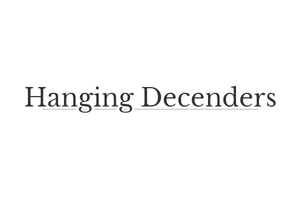
A Better underline
By Matt Gross

アンダーラインを少しオシャレにしたもの
アンダーラインはbackgroundで1pxで表現されています、gの文字の重なりのところに白い空白があるのは白色のtext-shadowが左右に存在していて、見えている文字も実はtext-shadowで文字はtransparentで透明に処理されています
あとはおまけ程度に、マウスオーバーでアンダーラインの長さが変化します
CSS
body {
  height: 100%;
  width: 100%;
  padding: 100px 0;
  margin: 0;
  display: flex;
  justify-content: center;
  font-family: 'Libre Baskerville', serif;
  font-weight: 100;
}

span {
  font-size: 50px;
  /*  shadows render better in certain browsers than text  */
  color: transparent;
  text-shadow: 0 0 #333, .1em 0 0 #fff, 0 0, -.1em 0 0 #fff;
  /*  gradient background allows us to use css only & re-position it  */
  background: -webkit-linear-gradient(#999, #999) center 1.09em no-repeat;
  background: linear-gradient(#999, #999) center 1.09em no-repeat;
  /*  can precisely control size in relation to the text  */
  background-size: 85% 1px;
  /*  now the underline supports transitions  */
  -webkit-transition: .2s ease;
  transition: .2s ease;
}

span:hover {
  /*  backgrounds won't size larger than 100%  */
  background-size: 95% 1px;
}
コードも短く実装できます、日本語ではローマ字のようにベースラインから飛び出るってことは無いのですが、ローマ字なタイトルの時には結構使えると思います。
文字との間隔と太さも、通常のアンダーラインよりも使い勝手は良さそうです
PR
短縮URL:


COMMENT