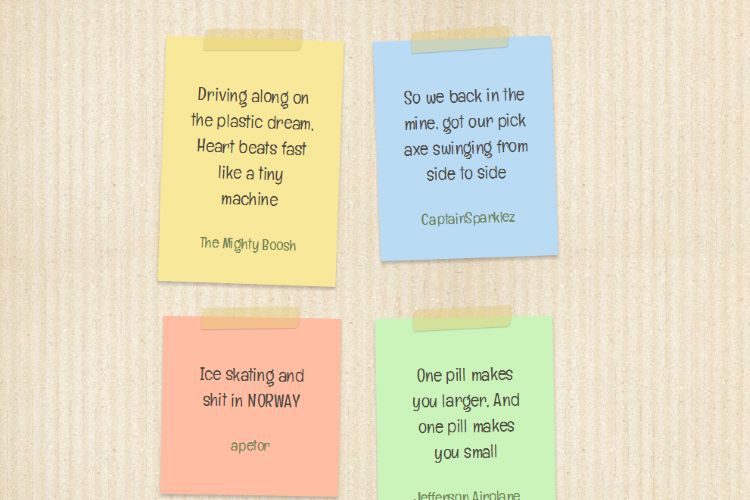
パステルカラーの付箋風のWEBデザインが魅力的 Sticky notes without images
PR
Sticky notes without images
By hiteshtr
http://codepen.io/hiteshtr/pen/Ljopx
背景は画像を利用しているものの、他はCSSでデザインされています。ブロックを付箋で表現したデザインがとてもいいですね
それぞれの付箋はCSSでコントロールされて色と傾きが決定されていますが、nth-child()を使えば何番目かでコントロールすることができるようになるので、CMS等のツールを使った時に自動的に4つごとにデザインが繰り返すようにループさせるのが簡単に出来ます。
新着記事一覧等にこれを利用するのも有りかと思います
CSSのコードはこのようになっています
* {
 -webkit-box-sizing: border-box;
 -moz-box-sizing: border-box;
 box-sizing: border-box;
}

::-moz-selection {
 background: #C6FF91;
 text-shadow: none;
}

::selection {
 background: #C6FF91;
 text-shadow: none;
}

.clearfix:before,
.clearfix:after {
 content: " ";
 display: table;
}

.clearfix:after {
 clear: both;
}

.clearfix {
 *zoom: 1;
}

body {
 background: url(http://i.imgur.com/2BdQt0g.jpg);
 margin: 0;
 padding: 0;
}

.wrapper {
 margin: 60px auto 0 auto;
}

/* Note styles */
.note-wrap {
 width: 235px;
 min-height: 235px;
 padding: 35px;
 margin: 0 22px 44px 22px;
 position: relative;
 font-size: 24px;
 vertical-align: top;
 display: inline-block;
 font-family: Englebert, Arial;
 color: #4b453c;
 background: #F7E999;
 line-height: 34px;
 text-align: center;
 box-shadow: 0 4px 5px rgba(0, 0, 0, 0.2);
}
.note-wrap:before {
 display: block;
 content: "";
 background: rgba(227, 200, 114, 0.4);
 width: 130px;
 height: 28px;
 box-shadow: 0 1px 1px rgba(0, 0, 0, 0.2);
 border-radius: 6px/18px 0;
 position: absolute;
 top: -13px;
 left: 50px;
 -webkit-transform: rotate(-2deg);
 -moz-transform: rotate(-2deg);
 -o-transform: rotate(-2deg);
 -ms-transform: rotate(-2deg);
 transform: rotate(-2deg);
}
.note-wrap a {
 color: #6b824f;
 text-decoration: none;
 font-size: 20px;
 -webkit-transition: all 0.4s ease;
 -moz-transition: all 0.4s ease;
 -o-transition: all 0.4s ease;
 -ms-transition: all 0.4s ease;
 transition: all 0.4s ease;
}
.note-wrap a:hover {
 color: #D83A25;
}

.note-yellow {
 background: #F7E999;
 -webkit-transform: rotate(2deg);
 -moz-transform: rotate(2deg);
 -o-transform: rotate(2deg);
 -ms-transform: rotate(2deg);
 transform: rotate(2deg);
}

.note-blue {
 background: #b9dcf4;
 -webkit-transform: rotate(-2deg);
 -moz-transform: rotate(-2deg);
 -o-transform: rotate(-2deg);
 -ms-transform: rotate(-2deg);
 transform: rotate(-2deg);
}

.note-pink {
 background: #FFBDA3;
 -webkit-transform: rotate(1deg);
 -moz-transform: rotate(1deg);
 -o-transform: rotate(1deg);
 -ms-transform: rotate(1deg);
 transform: rotate(1deg);
}

.note-green {
 background: #CAF4B9;
 -webkit-transform: rotate(-1deg);
 -moz-transform: rotate(-1deg);
 -o-transform: rotate(-1deg);
 -ms-transform: rotate(-1deg);
 transform: rotate(-1deg);
}
コード自体はシンプルな方かと思います。
PR
短縮URL:


COMMENT