レスポンシブなCSSで作られた円形の画像ギャラリー circle image gallery (pure CSS version)
PR
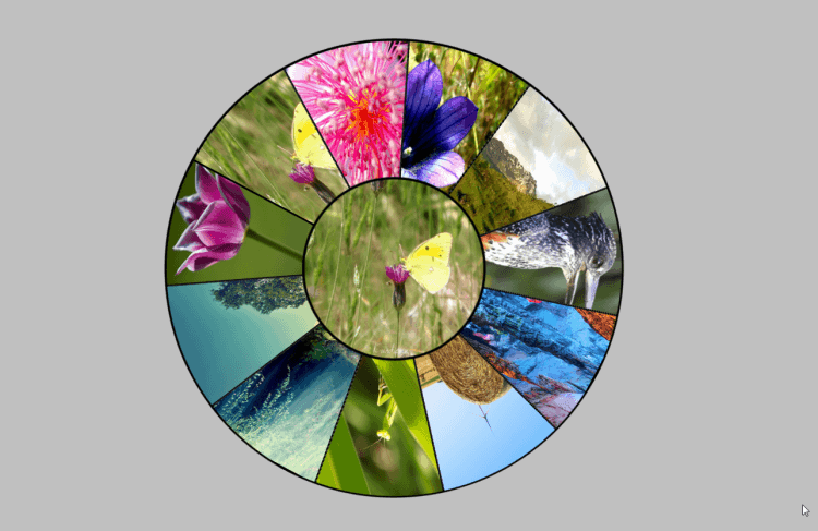
circle image gallery (pure CSS version)
CSSだけで作られた円形の画像ギャラリーです
周りの回転している画像にマウスポインターを乗せると中央の画像が切り替わるものです
レスポンシブ対応で画面のサイズに自動で合わせてくれます
アイディアをプラスするなら、周りの画像を動画のサムネイルにして、クリックすると中央で動画流れだすようにしたり
周りの画像を背景色+色コードに変えて、中央に文字とかアイコンを置いて色の違いを比較しやすくする物に使ったり
あとは、周りの円を12分割にして、それぞれに月を入れてクリックすると中央にカレンダーが表示されるとかも面白いかな
– CODE –
HTML
<div class='p'>Hover over image slices</div>
<div class='gallery'>
 <div class='gallery__item'></div>
 <div class='gallery__item'></div>
 <div class='gallery__item'></div>
 <div class='gallery__item'></div>
 <div class='gallery__item'></div>
 <div class='gallery__item'></div>
 <div class='gallery__item'></div>
 <div class='gallery__item'></div>
 <div class='gallery__item'></div>
 <div class='gallery__item'></div>
 <div class='gallery__item'></div>
 <div class='gallery__item'></div>
</div>
CSS (SCSS)
$n: 12; // has to match number of nodes in DOM
$r-outer: 40vmin;
$r-inner: $r-outer/2.5;

$images:
 "http://obomemo.com/img/00.jpg",
 "http://obomemo.com/img/01.jpg",
 "http://obomemo.com/img/02.jpg",
 "http://obomemo.com/img/03.jpg",
 "http://obomemo.com/img/04.jpg",
 "http://obomemo.com/img/05.jpg",
 "http://obomemo.com/img/06.jpg",
 "http://obomemo.com/img/07.jpg",
 "http://obomemo.com/img/08.jpg",
 "http://obomemo.com/img/09.jpg",
 "http://obomemo.com/img/10.jpg";

html { overflow: hidden; background: silver; }

.gallery, .gallery *, .gallery *:before, .gallery *:after {
 box-sizing: border-box;
 overflow: hidden;
 position: absolute;
 padding: 0;
 right: 50%; bottom: 50%;
 width: inherit; height: inherit;
}

.gallery {
 margin: -$r-outer;
 border: solid .25em;
 width: 2*$r-outer; height: 2*$r-outer;
 border-radius: 50%;
 animation: rot 95s linear infinite;
}

.gallery__item {
 $a: 360deg/($n - 1);
 border: solid .125em;
 @for $i from 0 to $n - 1 {
 &:nth-child(#{$i + 1}) {
 transform: rotate($i*$a) skew(90deg - $a);
 &:hover ~ .gallery__item:last-child, &:before {
 background-image: url(nth($images, $i + 1));
 }
 }
 }
 &:not(:last-child) {
 transform-origin: 100% 100%;
 &:before {
 margin: -2*$r-outer;
 transform: skew($a - 90deg) rotate($a/2 - 90deg);
 background-position: 50% -10%;
 background-size: 50% 50%;
 content: '';
 }
 }
 &:last-child {
 margin: -$r-inner;
 border: solid .25em;
 width: 2*$r-inner; height: 2*$r-inner;
 border-radius: 50%;
 background: url(nth($images, 1)) 50% 50%;
 background-size: cover;
 animation: inherit;
 animation-direction: reverse;
 }
}

@keyframes rot { to { transform: rotate(360deg); } }
PR
短縮URL:


COMMENT