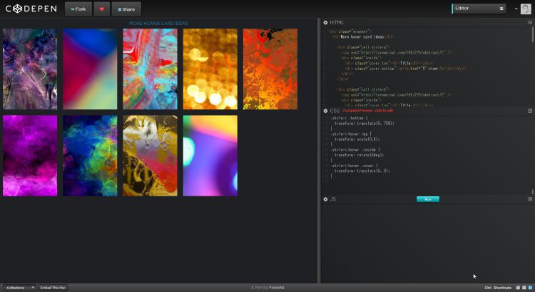
9つの画像のマウスオーバーでキャプションを表示させるアイディア
PR
Some hover effect ideas
カードタイプの画像にマウスオーバーをした時に表示するアニメーションのアイディア集です
9つのパターンがあり、どれも実用性のあるものとなっています
個人的には4番目、6番目が好み
– CODE –
HTML
<div class="wrapper">
 <h1>More hover card ideas</h1>

 <div class="cell style-a">
 <img src="http://lorempixel.com/185/275/abstract/1" />
 <div class="inside">
 <div class="cover top"><h1>Title</h1></div>
 <div class="cover bottom"><p><a href="#">view</a></p></div>
 </div>
 </div>

 <div class="cell style-b">
 <img src="http://lorempixel.com/185/275/abstract/2" />
 <div class="inside">
 <div class="cover top"><h1>Title</h1></div>
 <div class="cover bottom"><p><a href="#">view</a></p></div>
 </div>
 </div>

 <div class="cell style-c">
 <img src="http://lorempixel.com/185/275/abstract/3" />
 <div class="inside">
 <div class="cover top"><h1>Title</h1></div>
 <div class="cover bottom"><p><a href="#">view</a></p></div>
 </div>
 </div>

 <div class="cell style-d">
 <img src="http://lorempixel.com/185/275/abstract/4" />
 <div class="inside">
 <div class="cover top"><h1>Title</h1></div>
 <div class="cover bottom"><p><a href="#">view</a></p></div>
 </div>
 </div>

 <div class="cell style-e">
 <img src="http://lorempixel.com/185/275/abstract/5" />
 <div class="inside">
 <div class="cover top"><h1>Title</h1></div>
 <div class="cover bottom"><p><a href="#">view</a></p></div>
 </div>
 </div>

 <div class="cell style-f">
 <img src="http://lorempixel.com/185/275/abstract/6" />
 <div class="inside">
 <div class="cover top"><h1>Title</h1></div>
 <div class="cover bottom"><p><a href="#">view</a></p></div>
 </div>
 </div>

 <div class="cell style-g">
 <img src="http://lorempixel.com/185/275/abstract/7" />
 <div class="inside">
 <div class="cover top"><h1>Title</h1></div>
 <div class="cover bottom"><p><a href="#">view</a></p></div>
 </div>
 </div>

 <div class="cell style-h">
 <img src="http://lorempixel.com/185/275/abstract/8" />
 <div class="inside">
 <div class="cover top"><h1>Title</h1></div>
 <div class="cover bottom"><p><a href="#">view</a></p></div>
 </div>
 </div>

 <div class="cell style-i">
 <img src="http://lorempixel.com/185/275/abstract/9" />
 <div class="inside">
 <div class="cover top"><h1>Title</h1></div>
 <div class="cover bottom"><p><a href="#">view</a></p></div>
 </div>
 </div>

</div>
CSS (LESS)
@import url(http://fonts.googleapis.com/css?family=Carme);
* { box-sizing: border-box }
body {
 font-family: 'Carme', sans-serif;
 background: #1E2024;
 font-size: 16px;

}

@color : rgba(239, 74, 74, 1);

.wrapper {
 margin: 10px auto;
 //width: 615px;

 h1 {
 text-transform: uppercase;
 text-align: center;
 color: #2980b9;
 }
}

img {
 transform: scale3d(1, 1, 1);
 position: relative;
 display: block;
}


.grid {
 margin: 10px auto;
 width: 615px;
 &:after {
 content: '';
 display: block;
 clear: both;
 }
}


.cell {
 background: #262932;
 position: relative;
 overflow: hidden;
 float: left;
 margin: 10px;
 transform: scale(1);

 &:hover p { margin-top: -1px; }

 .inside {
 position: absolute;
 width: 300%;
 left: -100%;
 height: 100%;
 top: 0;
 }

 h1, p {
 position: absolute;
 width: 100%;
 left: 0;
 color: #ECECEC;
 text-align: center;
 padding: 10px;
 }

 h1 {
 border-bottom: 1px solid #ECECEC;
 }

 p {
 // margin-top: -1px;
 border-top: 1px solid #ECECEC;
 }

 a {
 color: #ECECEC;
 text-decoration: none;
 }

 .cover {
 position: absolute;
 height: 100%;
 width: 100%;
 padding: 0 33.33333333%;
 left: 0;
 background: @color;


 }

 .top {
 top: -50%;
 h1 {
 bottom: 0;
 }
 }

 .bottom {
 bottom: -50%;
 }

}


/* sliding doors */
.style-a {

 img, .cover {
 transition: all 1s ease;
 }

 .top {
 transform : translate(0, -50%);
 }
 .bottom {
 transform : translate(0, 50%);
 }

 &:hover {
 img {
 transform: scale(.9);
 }
 .cover {
 transform : translate(0, 0);
 }
 }

}

.style-b {

 img, .cover {
 transition: all 1s ease;
 }

 .top {
 transform : translate(0, -50%);
 }
 .bottom {
 transform : translate(0, 50%);
 }

 &:hover {
 img {
 transform: scale(.9);
 }
 .top {
 transform : translate(0, -75px);
 }
 .bottom {
 transform : translate(0, 75px);
 }
 }

}

.style-c {

 img, .cover {
 transition: all 1s ease;
 }
 .cover {
 opacity: 0;
 }
 .top {
 transform : translate(0, -50%);
 }
 .bottom {
 transform : translate(0, 50%);
 }

 &:hover {
 img {
 transform: scale(.9);
 }
 .cover {
 opacity: 1;
 transform : translate(0, 0);
 }
 }

}

/* slide-in doors */
.style-d {

 img, .cover {
 transition: transform 1s ease;
 }

 .top {
 transform : translate(-100%, 0%);
 }
 .bottom {
 transform : translate(100%, 0%);
 }

 &:hover {
 .cover {
 transform : translate(0%, 0%);
 }
 }

}

.style-e {

 img, .cover {
 transition: transform 1s ease;
 }

 .top {
 transform : translate(-100%, 75px);
 }
 .bottom {
 transform : translate(100%, 75px);
 }

 &:hover {
 .cover {
 transform : translate(0%, 0%);
 }
 }

}

.style-f {

 img, .cover {
 transition: transform 1s ease, opacity .5s ease;
 }
 .cover {
 opacity: 0;
 }
 .top {
 transform : translate(-25%, -75px);
 }
 .bottom {
 transform : translate(25%, 75px);
 }

 &:hover {
 .cover {
 opacity: 1;
 }
 .top {
 transform : translate(0%, -75px);
 }
 .bottom {
 transform : translate(0%, 75px);
 }
 }

}

/* rotate */
.style-g {

 img, .cover {
 transition: transform 1s ease, opacity .5s ease;
 }

 .cover {
 opacity: 0;
 }
 .top {
 transform : rotate(56deg) translate(50px, -60px);
 }
 .bottom {
 transform : rotate(56deg) translate(-50px, 60px);
 }

 &:hover {
 .cover {
 opacity: 1;
 transform : rotate(0deg);
 }
 }

}

.style-h {

 img, .cover {
 transition: transform 1s ease, opacity .5s ease;
 }

 .cover {
 opacity: 0;
 }
 .top {
 transform : rotate(56deg) translate(50px, -80%);
 }
 .bottom {
 transform : rotate(56deg) translate(-50px, 80%);
 }

 &:hover {
 .cover {
 opacity: 1;
 transform : rotate(0deg);
 }
 .top {}
 .bottom {}
 }

}

.style-i {

 img, .cover, .inside {
 transition: transform 1s ease, opacity .5s ease;
 }

 .inside {
 transition: all 1s ease 1s;
 transform : rotate(90deg);
 }

 .top {
 transform : translate(0, -75%);
 }
 .bottom {
 transform : translate(0, 75%);
 }

 &:hover {
 img {
 transform: scale(.8);
 }
 .inside {
 transform : rotate(0deg);
 }
 .cover {
 transform : translate(0, 0);
 }
 }

}
PR
短縮URL:


COMMENT