ボックスの高さを合わせて、背景を常に表示させていられるようにするテクニックのコード 『Equal Height Price Blocks』
PR
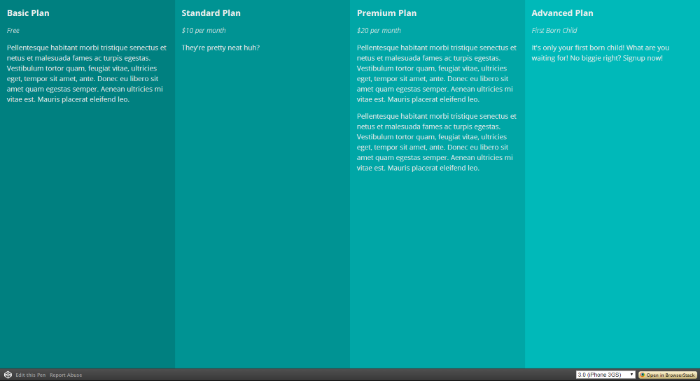
Equal Height Price Blocks
By Dennis Gaebel
リンク先のページの画面を大きくさせたり、小さくさせてみてください
それぞれのブロックで常に背景が表示されるようになっています
原理
- Warpperで高さを画面の高さに合わせる 【height100%】
- 普通にブロックをfloatで横に並べる
- beforeをfixedで固定する 【positon】
- それぞれのブロックのbeforeでフロックを覆うように配置する 【height 100%+BOXと同じ幅(25%)】
- z-indexでbeforeを一番下に持っていく
Warpperで画面の高さに合わせるためには、まずBodyとHTMLにそれぞれheight100%を指定しておかないといけない
2カラム以上のデザインで
特ににサイドバーの下の空きがスペースの色が間抜けになってしまう時にはこの方法を応用すると良いかと思います
コード
HTML
<div class="wrapper">
  <article>
  </article>

  <article>
  </article>

  <article>
  </article>

  <article>
  </article>
</div>
CSS (SCSS)
$width: 25%;

*,
:before,
:after {
  box-sizing: border-box;
}

:before,
:after {
  content: "";
  height: 100%;
  position: fixed;
  top: 0;
  bottom: 0;
  left: 0;
  width: 100%;
  z-index: -1;
}

html {
  font: normal 100%/1.5 sans-serif;
  word-wrap: break-word;
}

html,
body {
  height: 100%;
}

.wrapper {
  overflow: auto;
  height: 100%;
  position: relative;
}

article {
  float: left;
  padding: 0 1rem; // 0 16px
  font-family: 'Open Sans', sans-serif;
  font-weight: 400;
  font-size: 1rem;
  color: #EFEFEF;

  > header {

      h1 {
        font-size: 1.25em; // 20px / 16px
        font-weight: 700;
        line-height: 1;
        margin-bottom: 20px;
      }

      span {
        font-weight: 300;
        font-style: italic;
      }
  }

  &:nth-child(1) {
    width: $width;

    &:before {
      left: 0;
      width: $width;
      background: teal;
    }
  }

  &:nth-child(2) {
    width: $width;

    &:before {
      left: $width;
      width: $width;
      background: scale-lightness(teal, 5%);
    }
  }

  &:nth-child(3) {
    width: $width;

    &:before {
      left: $width * 2;
      width: $width;
      background: scale-lightness(teal,10%);
    }
  }

  &:nth-child(4) {
    width: $width;

    &:before {
      left: $width * 3;
      width: $width;
      background: scale-lightness(teal, 15%);
    }
  }
}
コード一式をダウンロード
DOWNLOAD
PR
短縮URL:


COMMENT