ぷにっと感がたまらない ローディングに使えるCSSアニメーション
PR
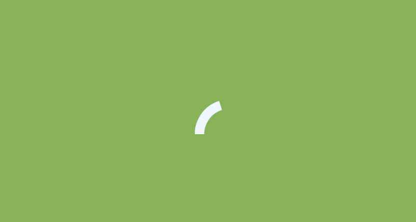
Arcs
http://codepen.io/jeroens/pen/zxpreV
ぷにぷにピョンピョン跳ねる感じが良い CSSアニメーション。
プニッと感がとても良い出来です
ローディングの表示に等に使えば、待っている間に和みを与えられるのではないでしょうか
HTML
<div class="container green-100 animation-07">
 <div class="arc">
 <div class="arc-cube"></div>
 </div>
</div>
CSS
@-webkit-keyframes arc {
 0% {
 border-width: 30px;
 }
 25% {
 border-width: 15px;
 }
 50% {
 -webkit-transform: rotate(27deg);
 transform: rotate(27deg);
 border-width: 30px;
 }
 75% {
 border-width: 15px;
 }
 100% {
 border-width: 30px;
 }
}
@keyframes arc {
 0% {
 border-width: 30px;
 }
 25% {
 border-width: 15px;
 }
 50% {
 -webkit-transform: rotate(27deg);
 transform: rotate(27deg);
 border-width: 30px;
 }
 75% {
 border-width: 15px;
 }
 100% {
 border-width: 30px;
 }
}
.green-100 {
 background-color: #88b257;
}

.green-200 {
 background-color: #7da84d;
}

body {
 padding: 0;
 margin: 0;
 font-family: Tahoma, sans-serif;
}

.container {
 position: relative;
 width: 100vw;
 height: 100vh;
 -webkit-perspective: 1000px;
 perspective: 1000px;
 -webkit-perspective: 1000px;
 perspective: 1000px;
 overflow: hidden;
}

.cube {
 position: absolute;
 bottom: 50%;
 left: 50%;
 width: 30px;
 height: 30px;
 margin-left: -15px;
 margin-top: 0;
}

.cube-2d {
 background-color: #eef8fc;
}
.arc {
 position: absolute;
 bottom: 50%;
 left: 50%;
 margin-left: -70px;
 width: 140px;
 height: 70px;
 overflow: hidden;
}

.arc-cube {
 position: absolute;
 bottom: -70px;
 left: 50%;
 margin-left: -70px;
 width: 140px;
 height: 140px;
 border-style: solid;
 border-top-color: transparent;
 border-right-color: #eef8fc;
 border-left-color: transparent;
 border-bottom-color: transparent;
 border-radius: 50%;
 box-sizing: border-box;
 -webkit-animation: arc 2s ease-in-out infinite;
 animation: arc 2s ease-in-out infinite;
 -webkit-transform: rotate(-200deg);
 -ms-transform: rotate(-200deg);
 transform: rotate(-200deg);
}
PR
短縮URL:


COMMENT