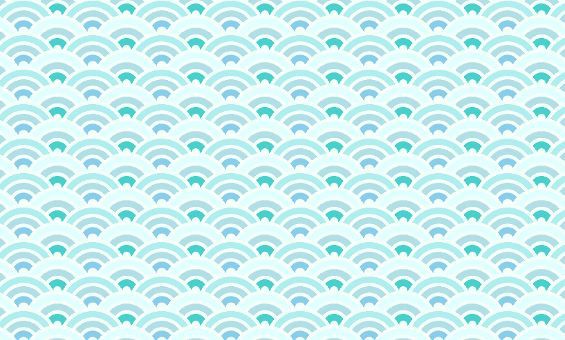
CSSで和の波模様の青海波(せいがいは)のパターンをアニメーション付きで表現したもの
PR
CSS3 Animated Japanese Pattern Waves

和柄で使われる文様 青海波文様をCSSで作り、アニメーションを付けて波の動きをさらに表現したものです
ヘッダー部分の背景や、フッター部分の背景として使うと面白いかと思う
ヘッダーやフッターで実際に使うには、親要素つくってpositionでrelativeにして、各要素にtop、leftの指定が必要かなと
コード 背景として利用しやすいようにカスタマイズ済み
HTML
<div class="waves1"></div>
<div class="waves2"></div>
<div class="waves3"></div>
CSS
body{background:silver;margin:0;overflow:hidden}

.waves1{
  position: absolute;
  width: 110%;
  height: 500px;
  z-index: 50;
  background-size: 100px 50px;
  background-image:
  radial-gradient(circle at 50% 100%, MintCream 10%, SkyBlue 11%, SkyBlue 23%, MintCream 24%, MintCream 30%, PowderBlue 31%, PowderBlue 43%, MintCream 44%, MintCream 50%, PaleTurquoise 51%, PaleTurquoise 63%, MintCream 64%, MintCream 71%, transparent 71%, transparent);

  animation: waves 3s ease-in-out infinite;
  -o-animation: waves 3s ease-in-out infinite;
  -moz-animation: waves 3s ease-in-out infinite;
  -webkit-animation: waves 3s ease-in-out infinite;
}

.waves2{
  position: absolute;
  width: 110%;
  height: 500px;
  z-index: 10;
  background-size: 100px 50px;
  background-image:
  radial-gradient(circle at 100% 150%, PowderBlue 24%, MintCream 25%, MintCream 28%, LightCyan 29%, LightCyan 36%, MintCream 36%, MintCream 40%, transparent 40%, transparent),
  radial-gradient(circle at 0 150%, PowderBlue 24%, MintCream 25%, MintCream 28%, LightCyan 29%, LightCyan 36%, MintCream 36%, MintCream 40%, transparent 40%, transparent),
  radial-gradient(circle at 100% 50%, MintCream 5%, MediumTurquoise 6%, MediumTurquoise 15%, MintCream 16%, MintCream 20%, PowderBlue 21%, PowderBlue 30%, MintCream 31%, MintCream 35%, LightCyan 36%, LightCyan 45%, MintCream 46%, MintCream 49%, transparent 50%, transparent),
  radial-gradient(circle at 0 50%, MintCream 5%, MediumTurquoise 6%, MediumTurquoise 15%, MintCream 16%, MintCream 20%, PowderBlue 21%, PowderBlue 30%, MintCream 31%, MintCream 35%, LightCyan 36%, LightCyan 45%, MintCream 46%, MintCream 49%, transparent 50%, transparent);

  animation: waves2 3s ease-in-out infinite;
  -o-animation: waves2 3s ease-in-out infinite;
  -moz-animation: waves2 3s ease-in-out infinite;
  -webkit-animation: waves2 3s ease-in-out infinite;
}

.waves3{
  position: absolute;
  width: 110%;
  height: 500px;
  z-index: 100;
  background-size: 100px 50px;
  background-image:
  radial-gradient(circle at 100% 150%, PowderBlue 24%, MintCream 25%, MintCream 28%, LightCyan 29%, LightCyan 36%, MintCream 36%, MintCream 40%, transparent 40%, transparent),
  radial-gradient(circle at 0 150%, PowderBlue 24%, MintCream 25%, MintCream 28%, LightCyan 29%, LightCyan 36%, MintCream 36%, MintCream 40%, transparent 40%, transparent);

  animation: waves2 3s ease-in-out infinite;
  -o-animation: waves2 3s ease-in-out infinite;
  -moz-animation: waves2 3s ease-in-out infinite;
  -webkit-animation: waves2 3s ease-in-out infinite;
}

@keyframes waves {
  0% {left: 5px}
  50% {left: -5px}
  100% {left: 5px}
}
@-o-keyframes waves {
  0% {left: 5px}
  50% {left: -5px}
  100% {left: 5px}
}
@-moz-keyframes waves {
  0% {left: 5px}
  50% {left: -5px}
  100% {left: 5px}
}
@-webkit-keyframes waves {
  0% {left: 5px}
  50% {left: -5px}
  100% {left: 5px}
}

@keyframes waves2 {
  0% {left: -5px}
  50% {left: 5px}
  100% {left: -5px}
}
@-o-keyframes waves2 {
  0% {left: -5px}
  50% {left: 5px}
  100% {left: -5px}
}
@-moz-keyframes waves2 {
  0% {left: -5px}
  50% {left: 5px}
  100% {left: -5px}
}
@-webkit-keyframes waves2 {
  0% {left: -5px}
  50% {left: 5px}
  100% {left: -5px}
}
PR
短縮URL:


COMMENT