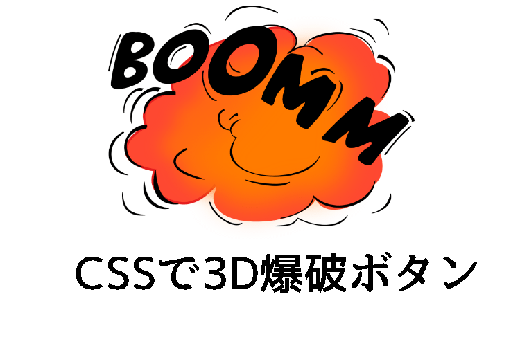
CSSだけで作られた3Dの爆破ボタン [CODEPEN]
PR
3D CSS “DROP THE BOMB” BUTTON
CSSだけで作れれた爆破ボタンです
立体的に見えて、さらにボタンをクリックするとボタンを押したかのようになります
inputタグを使って作らているので送信ボタン等にも使えそうです
– CODE –
HTML
<h2>3D CSS "DROP THE BOMB" BUTTON</h2>


<input type="button" class="button" value="drop
the
bomb" />
<link async href="http://fonts.googleapis.com/css?family=Black%20Ops%20One" data-generated="http://enjoycss.com" rel="stylesheet" type="text/css"/>


<h4>CSS generated with
 </br><strong>enjoycss.com</strong></br> http://enjoycss.com/3j/9#background</h4>
CSS
html{
 background-image:url(http://enjoycss.com/bg-img/custom/23959-em3zjf.png);
 text-align: center;
 color: rgba(0,0,0,0.7);
}

h2,h4{
 font-family:arial;
 text-align: center;
}

h4{
 font-weight: normal;
 font-size:1em;
 line-height:1.9em;
}

strong{
 font-size:1.6em;

 color:#c0392b;
}


/******** generated with enjoyCSS *******/


.button {
 -moz-box-sizing: border-box;
 -webkit-box-sizing: border-box;
 box-sizing: border-box;
 width: 128px;
 height: 128px;
 cursor: pointer;
 top: 0;
 border: 1px solid #B21522;
 -webkit-border-radius: 100px;
 border-radius: 100px;
 font: normal normal normal 20px/1.1 "Black Ops One", Helvetica, sans-serif;
 color: rgba(255,255,255,0.9);
 text-align: center;
 white-space: pre;
 background: -webkit-radial-gradient( 50% 50% , ellipse closest-side, rgba(255,255,255,0.2) 0, rgba(0,0,0,0) 100%), #C91826;
 background: -moz-radial-gradient( 50% 50% , ellipse closest-side, rgba(255,255,255,0.2) 0, rgba(0,0,0,0) 100%), #C91826;
 background: radial-gradient( 50% 50% , ellipse closest-side, rgba(255,255,255,0.2) 0, rgba(0,0,0,0) 100%), #C91826;
 background-repeat: no-repeat;
 background-position: 0 100%;
 -webkit-background-size: 158px 142px;
 background-size: 158px 142px;
 -webkit-box-shadow: 1px 16px 10px 5px rgba(0,0,0,0.2) , 0 14px 0 0 #000000 , 4px 8px 15px 4px rgba(0,0,0,0.4) , 5px 1px 5px 0 rgba(255,255,255,0.2) inset, 5px -4px 5px 0 rgba(255,255,255,0.2) inset, -2px 3px 6px 0 rgba(0,0,0,0.2) inset;
 box-shadow: 1px 16px 10px 5px rgba(0,0,0,0.2) , 0 14px 0 0 #000000 , 4px 8px 15px 4px rgba(0,0,0,0.4) , 5px 1px 5px 0 rgba(255,255,255,0.2) inset, 5px -4px 5px 0 rgba(255,255,255,0.2) inset, -2px 3px 6px 0 rgba(0,0,0,0.2) inset;
 text-shadow: 0 -1px 0 rgba(40,40,40,0.6) ;
 -webkit-transition: all 40ms 0 cubic-bezier(0.6, -0.28, 0.735, 0.04);
 -moz-transition: all 40ms 0 cubic-bezier(0.6, -0.28, 0.735, 0.04);
 -o-transition: all 40ms 0 cubic-bezier(0.6, -0.28, 0.735, 0.04);
 transition: all 40ms 0 cubic-bezier(0.6, -0.28, 0.735, 0.04);
 -moz-transform: rotateX(35deg) scaleX(1) scaleY(1) scaleZ(1) translateY(15px) translateZ(40px) ;
 -webkit-transform: rotateX(35deg) scaleX(1) scaleY(1) scaleZ(1) translateY(15px) translateZ(40px) ;
 transform: rotateX(35deg) scaleX(1) scaleY(1) scaleZ(1) translateY(15px) translateZ(40px) ;
 outline:none;
}

.button:hover {
 background: -webkit-radial-gradient( 50% 50% , ellipse closest-side, rgba(255,255,255,0.28) 0, rgba(0,0,0,0) 100%), #a80008;
 background: -moz-radial-gradient( 50% 50% , ellipse closest-side, rgba(255,255,255,0.28) 0, rgba(0,0,0,0) 100%), #a80008;
 background: radial-gradient( 50% 50% , ellipse closest-side, rgba(255,255,255,0.28) 0, rgba(0,0,0,0) 100%), #a80008;
 -webkit-box-shadow: 1px 16px 10px 5px rgba(0,0,0,0.2) , 0 14px 0 0 #000000 , 4px 8px 15px 4px rgba(0,0,0,0.4) , 5px 1px 5px 0 rgba(255,255,255,0.2) inset, 5px -4px 5px 0 rgba(255,255,255,0.2) inset, -2px 2px 6px 0 rgba(0,0,0,0.2) inset;
 box-shadow: 1px 16px 10px 5px rgba(0,0,0,0.2) , 0 14px 0 0 #000000 , 4px 8px 15px 4px rgba(0,0,0,0.4) , 5px 1px 5px 0 rgba(255,255,255,0.2) inset, 5px -4px 5px 0 rgba(255,255,255,0.2) inset, -2px 2px 6px 0 rgba(0,0,0,0.2) inset;
 -webkit-transition: all 0 0 cubic-bezier(0.42, 0, 0.58, 1);
 -moz-transition: all 0 0 cubic-bezier(0.42, 0, 0.58, 1);
 -o-transition: all 0 0 cubic-bezier(0.42, 0, 0.58, 1);
 transition: all 0 0 cubic-bezier(0.42, 0, 0.58, 1);
}

.button:active {
 position: relative;
 top: 6px;
 background: -webkit-radial-gradient( 50% 50% , ellipse closest-side, rgba(255,255,255,0.2) 0, rgba(0,0,0,0) 100%), #c60009;
 background: -moz-radial-gradient( 50% 50% , ellipse closest-side, rgba(255,255,255,0.2) 0, rgba(0,0,0,0) 100%), #c60009;
 background: radial-gradient( 50% 50% , ellipse closest-side, rgba(255,255,255,0.2) 0, rgba(0,0,0,0) 100%), #c60009;
 -webkit-box-shadow: 1px 5px 8px 4px rgba(0,0,0,0.4) , 0 7px 0 0 #000000 , 1px 2px 1px 1px rgba(0,0,0,0.6) , 3px 1px 5px 0 rgba(255,255,255,0.2) inset, 3px -6px 5px 0 rgba(255,255,255,0.2) inset, -1px 1px 4px 0 rgba(0,0,0,0.2) inset;
 box-shadow: 1px 5px 8px 4px rgba(0,0,0,0.4) , 0 7px 0 0 #000000 , 1px 2px 1px 1px rgba(0,0,0,0.6) , 3px 1px 5px 0 rgba(255,255,255,0.2) inset, 3px -6px 5px 0 rgba(255,255,255,0.2) inset, -1px 1px 4px 0 rgba(0,0,0,0.2) inset;
 -webkit-transition: all 40ms 0 cubic-bezier(0.42, 0, 0.58, 1);
 -moz-transition: all 40ms 0 cubic-bezier(0.42, 0, 0.58, 1);
 -o-transition: all 40ms 0 cubic-bezier(0.42, 0, 0.58, 1);
 transition: all 40ms 0 cubic-bezier(0.42, 0, 0.58, 1);
}
PR
短縮URL:


COMMENT