CSSで作られた、かわいいデザインのボタン 10種
PR
オシャレかわいい CSSボタン
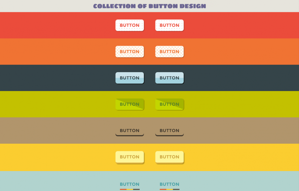
かわいいデザインの画像を使わない、CSSだけで作られたボタン。マウスオーバーのアニメーションもそれぞれ違ったものが作られていてユニーク。ボタンと合うカラーが背景に使われているのでその色も参考にして利用すると、センスのあるボタンになる。
– CODE –
HTML
<link href='http://fonts.googleapis.com/css?family=Montserrat|Sigmar+One' rel='stylesheet' type='text/css'> <h1> collection of button design</h1> <div class="one"> <a href="#">button</a> <a href="#">button</a> </div> <div class="two"> <a href="#">button</a> <a href="#">button</a> </div> <div class="three"> <a href="#">button</a> <a href="#">button</a> </div> <div class="four"> <a href="#">button</a> <a href="#">button</a> </div> <div class="five"> <a href="#">button</a> <a href="#">button</a> </div> <div class="six"> <a href="#">button</a> <a href="#">button</a> </div> <div class="seven"> <a href="#">button</a> <a href="#">button</a> </div> <div class="eight"> <a href="#">button</a> <a href="#">button</a> </div> <div class="nine"> <a href="#">button</a> <a href="#">button</a> </div> <div class="ten"> <a href="#"><span>→</span>button<span>←</span></a> </div> <h2>The END!</h2>
CSS
body {
  margin: 0;
}
h1, h2 {
  text-align: center;
  background: #E7E5DD;
  margin: 0;
  color: #6C6692;
  font-family: 'Sigmar One', cursive;
  line-height: 60px;
}
div {
  padding: 20px;
  text-align: center;
}
a {
  display: inline-block;
  text-decoration: none;
  text-transform: uppercase;
  letter-spacing: 1px;
  margin: 15px 25px;
  padding: 15px 20px;
  font-size: 20px;
  font-weight: bold;
  font-family: 'Montserrat', sans-serif;
  -webkit-transition: 0.4s ease-in-out;
  -o-transition: 0.4s ease-in-out;
  transition: 0.4s ease-in-out;
}
.one {
  background: #EC4D3C;
}
.one a {
  border-radius: 10px;
  color:  #EC4D3C;
  background-color: white;
  background-image: -webkit-radial-gradient(#FCD2D1 2px, rgba(255,0,0,0) 2px);
  background-image: -o-radial-gradient(#FCD2D1 2px, rgba(255,0,0,0) 2px);
  background-image: radial-gradient(#FCD2D1 2px, transparent 2px);
  background-size: 12px 12px;
  box-shadow: 2px 2px 3px rgba(0,0,0,0.3);
}
.one a:hover {
  background-size: 16px 16px;
}
.two {
  background: #F17434;
}
.two a {
  border-radius: 10px;
  color:  #F17434;
  background-color: white;
  background-image:
-webkit-repeating-linear-gradient(45deg, #FFDDBB, #FFDDBB 1px, rgba(255,0,0,0) 2px, rgba(255,0,0,0) 10px),
-webkit-repeating-linear-gradient(135deg, #FFDDBB, #FFDDBB 1px, rgba(255,0,0,0) 2px, rgba(255,0,0,0) 10px);
  background-image:
-o-repeating-linear-gradient(45deg, #FFDDBB, #FFDDBB 1px, rgba(255,0,0,0) 2px, rgba(255,0,0,0) 10px),
-o-repeating-linear-gradient(135deg, #FFDDBB, #FFDDBB 1px, rgba(255,0,0,0) 2px, rgba(255,0,0,0) 10px);
  background-image:
repeating-linear-gradient(45deg, #FFDDBB, #FFDDBB 1px, transparent 2px, transparent 10px),
repeating-linear-gradient(135deg, #FFDDBB, #FFDDBB 1px, transparent 2px, transparent 10px);
  box-shadow: 2px 2px 3px rgba(0,0,0,0.3);
}
.two a:hover {
  background-image:
-webkit-repeating-linear-gradient(left, #FFDDBB, #FFDDBB 1px, rgba(255,0,0,0) 2px, rgba(255,0,0,0) 10px);
  background-image:
-o-repeating-linear-gradient(90deg, #FFDDBB, #FFDDBB 1px, rgba(255,0,0,0) 2px, rgba(255,0,0,0) 10px);
  background-image:
repeating-linear-gradient(90deg, #FFDDBB, #FFDDBB 1px, transparent 2px, transparent 10px);
}
.three {
  background: #36454A;
}
.three a {
  border-radius: 10px;
  color:  #36454A;
  background: -webkit-linear-gradient(top, #A4D3E0 , #A4D3E0 50%, #CBE3EB 50%);
  background: -o-linear-gradient(top, #A4D3E0 , #A4D3E0 50%, #CBE3EB 50%);
  background: linear-gradient(to top, #A4D3E0 , #A4D3E0 50%, #CBE3EB 50%);
  box-shadow: 2px 2px 3px black;
}
.three a:hover {
  background: -webkit-linear-gradient(bottom, #A4D3E0 , #A4D3E0 50%, #CBE3EB 50%);
  background: -o-linear-gradient(bottom, #A4D3E0 , #A4D3E0 50%, #CBE3EB 50%);
  background: linear-gradient(to bottom, #A4D3E0 , #A4D3E0 50%, #CBE3EB 50%);
}
.four {
  background: #C4C100;
}
.four a{
  border-radius: 10px;
  color: #598428;
  background: -webkit-linear-gradient(70deg, #C3D600, #C3D600 50%, #A5B400 50%);
  background: -o-linear-gradient(20deg, #C3D600, #C3D600 50%, #A5B400 50%);
  background: linear-gradient(20deg, #C3D600, #C3D600 50%, #A5B400 50%);
  box-shadow: 2px 2px 3px rgba(0,0,0,0.3);
}
.four a:hover {
  background: -webkit-linear-gradient(-110deg, #C3D600, #C3D600 50%, #A5B400 50%);
  background: -o-linear-gradient(-160deg, #C3D600, #C3D600 50%, #A5B400 50%);
  background: linear-gradient(-160deg, #C3D600, #C3D600 50%, #A5B400 50%);
}
.five {
  background: #B1956C;
}
.five a {
  border-radius: 10px;
  color: #40382D;
  box-shadow: inset 0 -5px 0 #40382D;
}
.five a:hover {
  box-shadow: inset 0 -55px 0 #40382D,
    2px 2px 3px rgba(0,0,0,0.3);
  color: #DECDA5;
}
.six {
  background: #FCCE30;
}
.six a {
  border-radius: 10px;
  color: #CEA640;
  background: #FFF79A;
  border-bottom: 5px solid #E1B442;
  box-shadow: 3px 3px 3px rgba(0,0,0,0.3);
}
.six a:hover {
  box-shadow: 0 1px 2px rgba(0,0,0,0.3);
  text-shadow: 0 1px 0 rgba(0,0,0,0.3);
}
.seven {
  background: #B2D4CF;
}
.seven a {
  color: #45A0A4;
  background: -webkit-linear-gradient(right, #E3612C 0, #E3612C 33.3%, #FCCE30 33.3%, #FCCE30 66.6%, #58554B 66.6%, #58554B) bottom no-repeat;
  background: -o-linear-gradient(right, #E3612C 0, #E3612C 33.3%, #FCCE30 33.3%, #FCCE30 66.6%, #58554B 66.6%, #58554B) bottom no-repeat;
  background: linear-gradient(to right, #E3612C 0, #E3612C 33.3%, #FCCE30 33.3%, #FCCE30 66.6%, #58554B 66.6%, #58554B) bottom no-repeat;
  background-size: 70% 5px;
}
.seven a:hover {
  background-size: 100% 5px;
}
.eight {
  background: #E3612C;
}
.eight a {
  border-radius: 10px;
  background: #E8CCB5;
  color: #B05151;
  padding: 15px 30px;
  position: relative;
  box-shadow: 2px 2px 3px rgba(0,0,0,0.3);
}
.eight a:before, .eight a:after {
  content: "";
  display: inline-block;
  position: absolute;
  top: calc(50% - 5px);
  width: 10px;
  height: 10px;
  border-radius: 50%;
  background: #F58262;
  box-shadow: inset 0 -2px 0 #B05151;
  opacity: 0;
  -webkit-transition: 0.5s ease-in-out;
  -o-transition: 0.5s ease-in-out;
  transition: 0.5s ease-in-out;
}
.eight a:before {
  left: 13px;
}
.eight a:after {
  right: 13px;
}
.eight a:hover:before, .eight a:hover:after {
  opacity: 1;
}
.nine {
  background: #58554B;
}
.nine a {
  color: #E7E5DD;
  text-shadow: 1px 1px black;
  background: url(http://html5book.ru/wp-content/uploads/2015/01/borger-grey.png) repeat-x;
  border-bottom: 1px solid  #bfc1ad;
  border-left: 1px solid  #bfc1ad;
  border-right:  1px solid  #bfc1ad;
}
.nine a:hover {
  background-position: 300px 0;
}
.ten {
  background: #BDB9AB;
}
.ten a {
  color: #E7E5DD;
  border-radius: 25px;
  border: 3px solid #E7E5DD;
}
.ten a:hover {
  color: #BDB9AB;
  background: #E7E5DD;
}
.ten a span {
  opacity: 0;
  padding-left: 5px;
  padding-right: 5px;
  font-weight: bold;
  -webkit-transition: 0.4s ease-in-out;
  -o-transition: 0.4s ease-in-out;
  transition: 0.4s ease-in-out;
}
.ten a:hover span {
  opacity: 1;
  padding-left: 10px;
  padding-right: 10px;
  color: #BDB9AB;
}
PR
短縮URL:


COMMENT