【CSS】切り替えのアニメーションがクールなナビゲーション・メニュー
PR
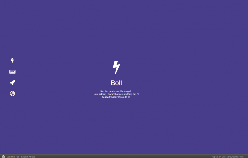
シングルページの構成で、ナビゲーションのアイコンをクリックすると。クールに切り替わるアニメーションがjavascriptを使わないCSSのみで作られたページデザイン、スムーズなアニメーションとクール
#code
HTML
<div class="ct" id="t1">
  <div class="ct" id="t2">
    <div class="ct" id="t3">
      <div class="ct" id="t4">
          <ul id="menu">
            <a href="#t1"><li class="icon fa fa-bolt" id="uno"></li></a>
            <a href="#t2"><li class="icon fa fa-keyboard-o" id="dos"></li></a>
            <a href="#t3"><li class="icon fa fa-rocket" id="tres"></li></a>
            <a href="#t4"><li class="icon fa fa-dribbble" id="cuatro"></li></a>
          </ul>
          <div class="page" id="p1">
             <section class="icon fa fa-bolt"><span class="title">Bolt</span><span class="hint">Like this pen to see the magic!...<br> Just kidding, it won't happen anything but I'll be really happy If you do so.</span></section>
          </div>
          <div class="page" id="p2">
            <section class="icon fa fa-keyboard-o"><span class="title">Type</span></section>
          </div>
          <div class="page" id="p3">
            <section class="icon fa fa-rocket"><span class="title">Rocket</span></section>
          </div>
          <div class="page" id="p4">
            <section class="icon fa fa-dribbble">
              <span class="title">Dribbble</span>
              <p class="hint">
                <a href="https://dribbble.com/albertohartzet" target="_blank">Im ready to play, <span class="hint line-trough">invite me </span> find me</a>
              </p>
              <p class="hint">Already invited by <a href="http://www.dribbble.com/mrpeters" target="_blank">Stan Peters</a></p>
            </section>
          </div>
      </div>
    </div>
  </div>
</div>
CSS
html, body, .page {
  width: 100%;
  height: 100%;
  margin: 0;
  padding: 0;
  transition: all .6s cubic-bezier(.5, .2, .2, 1.1);
  -webkit-transition: all .6s cubic-bezier(.5, .2, .2, 1.1);
  -moz-transition: all .6s cubic-bezier(.5, .2, .2, 1.1);
  -o-transition: all .6s cubic-bezier(.5, .2, .2, 1.1);
  color: #fff;
  overflow: hidden;
}

* {
  font-family: 'open sans', 'lato', 'helvetica', sans-serif;
}

.page {
  position: absolute;
}

#p1 {
  left: 0;
}

#p2, #p3, #p4 {
  left: 200%;
}

#p1 { background: darkslateblue; }
#p2 { background: tomato; }
#p3 { background: gold; }
#p4 { background: deeppink; }

#t2:target #p2,
#t3:target #p3,
#t4:target #p4 {
  transform: translateX(-190%);
  -webkit-transform: translateX(-190%);
  -moz-transform: translateX(-190%);
  -o-transform: translateX(-190%);
  transition-delay: .4s !important;
}

#t2:target #p1,
#t3:target #p1,
#t4:target #p1 {
  background: black;
}

#t2:target #p1 .icon,
#t3:target #p1 .icon,
#t4:target #p1 .icon {
  -webkit-filter: blur(3px);
}

.icon {
  color: #fff;
  font-size: 32px;
  display: block;
}

ul .icon:hover {
  opacity: 0.5;
}

.page .icon .title {
  line-height: 2;
}

#t2:target ul .icon,
#t3:target ul .icon,
#t4:target ul .icon {
  transform: scale(.6);
  -webkit-transform: scale(.6);
  -moz-transform: scale(.6);
  -o-transform: scale(.6);
  transition-delay: .25s;
}

#t2:target #dos,
#t3:target #tres,
#t4:target #cuatro {
  transform: scale(1.2) !important;
  -webkit-transform: scale(1.2) !important;
  -moz-transform: scale(1.2) !important;
  -o-transform: scale(1.2) !important;
}

ul {
  position: fixed;
  z-index: 1;
  top: 0;
  bottom: 0;
  left: 0;
  margin: auto;
  height: 280px;
  width: 10%;
  padding: 0;
  text-align: center;
 }

#menu .icon {
  margin: 30px 0;
  transition: all .5s ease-out !important;
  -webkit-transition: all .5s ease-out;
  -moz-transition: all .5s ease-out;
  -o-transition: all .5s ease-out;
}

a {
  text-decoration: none;
}

.title, .hint {
  display: block;
}

.title {
  font-size: 38px;
}

.hint {
  font-size: 13px;
}

#p4 .hint {
  display: inherit !important;
}

.hint a {
  color: yellow;
  transition: all 250ms ease-out;
  -webkit-transition: all 250ms ease-out;
  -moz-transition: all 250ms ease-out;
  -o-transition: all 250ms ease-out;
}

.hint a:hover {
  color: #FFF;
}

.line-trough {
  text-decoration: line-through;
}

.page .icon {
  position: absolute;
  top: 0;
  bottom: 0;
  right: 10%;
  left: 0;
  width: 270px;
  height: 170px;
  margin: auto;
  text-align: center;
  font-size: 80px;
  line-height: 1.3;
  transform: translateX(360%);
  -webkit-transform: translateX(360%);
  -moz-transform: translateX(360%);
  -o-transform: translateX(360%);
  transition: all .5s cubic-bezier(.25, 1, .5, 1.25);
  -webkit-transition: all .5s cubic-bezier(.25, 1, .5, 1.25);
  -moz-transition: all .5s cubic-bezier(.25, 1, .5, 1.25);
  -o-transition: all .5s cubic-bezier(.25, 1, .5, 1.25);
}

.page#p1 .icon {
  height: 220px;
}

.page#p1 .icon {
  transform: translateX(10%) !important;
}

#t2:target .page#p2 .icon,
#t3:target .page#p3 .icon,
#t4:target .page#p4 .icon {
  transform: translateX(0) !important;
  -webkit-transform: translateX(0) !important;
  -moz-transform: translateX(0) !important;
  -o-transform: translateX(0) !important;
  transition-delay: 1s;
}
PR
短縮URL:


COMMENT