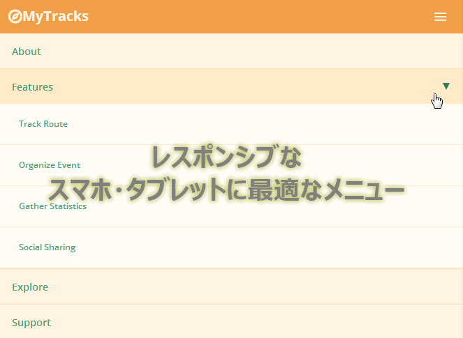
スマホ・タブレットに適したレスポンシブなドロップダウンメニュー
PR
画面の幅によって自動で変形するメニューです
スマホやタブレットにも最適なデザインに変動します
Treehouse Contest – Responsive Nav
3段階で表示が変わります
第一段階(最長)

第二段階(中長)
")
第三段階(最短)
")
日本語で使ってももレイアウトは崩れすそのまま使えそうです、フォントはメイリオとかを指定したほうが良さそうです
– CODE –
HTML
<div class="container"> <div class="row"> <nav role="navigation"> <span class="entypo-menu" id="toggle-menu"></span> <div class="logo"> <span class="entypo-compass"></span>MyTracks </div> <ul> <li><a href="#">About</a></li> <li class="has-child"><a href="#">Features</a> <ul class="dropdown"> <li><a href="#">Track Route</a></li> <li><a href="#">Organize Event</a></li> <li><a href="#">Gather Statistics</a></li> <li><a href="#">Social Sharing</a></li> </ul> </li> <li><a href="#">Explore</a></li> <li><a href="#">Support</a></li> <li><a href="#">Sign Up</a></li> </ul> </nav> </div> <div class="row"> <h1>← RESIZE ME →</h1> </div> </div>
CSS (SCSS)
@import url(http://fonts.googleapis.com/css?family=Open+Sans:400,300,600,700);
@import url(http://weloveiconfonts.com/api/?family=entypo);

// Icons
[class*="entypo-"]:before {
 font-family: 'entypo', sans-serif;
}

.cf:before,.cf:after {
 content: " ";
 display: table;
}
.cf:after { clear: both; }
.cf { *zoom: 1; }

* { box-sizing: border-box; }

// Variables
$night: #0A202B;
$mint: #3EA377;
$ivory: #FFF4E1;
$mango: #F09F47;
$base: 16px;

body {
 margin: 0;
 padding: 0;
 width: 100%;
 height: 100%;
 background: lighten($mint, 40%);
 font-size: $base;
 font-family: "Open Sans";
 font-weight: 300;
}

a {
 text-decoration: none;


}
.left { float: left; }
.right { float: right; }

.row {
 width: auto;
 margin: 0 auto;
 max-width: 62.5em; // 1,000px Maximum
}

h1 {
 min-width: 320px;
 text-align: center;
 color: $mint; }

nav {
 position: relative;
 margin: 20px auto 0;
 padding: 0;
 max-width: 62.5em; // 1,000px Maximum
 min-width: 20em; // 320px Minimum
 background: $ivory;
 line-height: 3.125em;
 overflow: visible;
 border: 1px solid lighten($ivory, 8%);
 border-radius: 6px;

 @media only screen and (max-width: 62.5em) {
 margin-top: 0;
 border: 0;
 border-radius: 0;
 }

 &:before, &:after {
 content: "";
 display: table;
 clear: both;
 }

 ul {
 margin: 0;
 padding: 0;
 display: inline;
 width: auto;
 height: auto !important;
 list-style: none;

 @media only screen and (max-width: 45em) {
 display: none;
 }

 li {
 float: right;
 margin: 0;
 padding: 0;
 text-align: center;
 cursor: pointer;

 @media only screen and (max-width: 45em){
 display: block;
 width: 100%;
 text-align: left;
 border-bottom: 1px solid darken($ivory, 10%);
 }

 &:hover {
 @media only screen and (max-width: 45em) {
 background: darken($ivory, 5%);
 }
 }

 & > a {
 padding: 0 20px;
 line-height: 3.125em;
 color: $mint;
 font-size: 0.875em;
 font-weight: 600;
 width: 100%;
 }

 & > a span {
 margin-right: 4px;
 color: darken($mint, 10%);
 }

 & > a:hover span {
 color: $mango;
 }
 } // End Nav List Elements
 } // End Nav List
} // End Nav

.has-child {
 position: relative;
 left: 0;

 &:after {
 position: absolute;
 margin-top: -5px;
 top: 27px;
 right: 5px;
 content: "";
 width: 0px;
 height: 0px;
 border-style: solid;
 border-width: 8px 5px 0 5px;
 border-color: $mango transparent transparent transparent;

 @media only screen and (max-width: 45em) {
 position: absolute;
 margin-top: -5px;
 top: 25px;
 right: 20px;
 content: "";
 width: 0px;
 height: 0px;
 border-style: solid;
 border-width: 10px 5px 0 5px;
 border-color: darken($mint, 10%) transparent transparent transparent;
 }
 }

 .dropdown {
 position: absolute;
 left: -40px;
 z-index: 99;
 display: none;
 margin-top: 10px;
 width: 200px;
 background: lighten($ivory, 4%);
 border-radius: 6px;

 @media only screen and (max-width: 45em) {
 position: relative;
 left: 0;
 z-index: auto;
 margin-top: 0;
 display: block;
 width: 100%;
 border-radius: 0;
 }

 &:after {
 position: absolute;
 top: -10px;
 left: 50%;
 margin-left: -10px;
 content: "";
 width: 0px;
 height: 0px;
 border-style: solid;
 border-width: 0 10px 10px 10px;
 border-color: transparent transparent white transparent;

 @media only screen and (max-width: 45em) {
 border: 0;
 }
 }
 & > li {
 float: left;
 width: 100%;
 font-size: 0.875em;
 font-weight: 600;
 color: $mint;
 border-bottom: 1px solid #EFEFEF;

 @media only screen and (max-width: 45em) {
 padding-left: 20px;
 background: lighten($ivory, 4%);
 border-bottom-color: darken($ivory, 5%);
 }
 }

 li a {
 display: block;
 padding: 10px;

 &:hover {
 color: darken($mint, 15%);
 }
 }
 }
}

.logo {
 float: left;
 margin: 0;
 padding: 0 15px;
 font-size: 1.25em;
 font-weight: 700;
 color: $ivory;
 background: $mango;
 border-right: 1px solid lighten($ivory, 8%);
 border-radius: 6px 0 0 6px;
 @media only screen and (max-width: 45em){
 width: 100%;
 border: 0;
 border-radius: 0;
 }
 @media only screen and (max-width: 62.5em){
 border-radius: 0;
 }
}

#toggle-menu {
 position: absolute;
 right: 1em;
 top: 0;
 display: none;
 cursor: pointer;
 font-size: 1.5em;
 color: $ivory;
 @media only screen and (max-width: 45em) {
 display: block;
 }
}
JS (jQuery)
 var w = $(window).width(),
 toggle = $('#toggle-menu'),
 menu = $('nav ul'),
 hasChild = $('.has-child'),
 dropdown = $('.dropdown');

$(function() {
 $(toggle).on('click', function(e) {
 e.preventDefault();
 menu.toggle();
 });

 $(hasChild).click(function(e) {
 e.preventDefault();
 dropdown.toggle();
 });
});

$(window).resize(function(){
 if(w > 320 && menu.is(':hidden')) {
 menu.removeAttr('style');}
});
PR
短縮URL:


yumi
こんにちは。
こちらの記事かなり参考にさせていただいてます。
.has-childのliを増やすと、一つをクリックするとすべての子要素が同時に開いてしまうのですが、この点を解消する策を教えてはいただけないでしょうか。
よろしくお願いいたします。
管理人
yumiさんへ
jQueryが一つしか対応できないようになっていますね
javascriptの以下の場所を置き換えれば出来るかと思います
これを
dropdown.toggle();
これに
$(this).children(“.dropdown”).toggle();
こちらにサンプル作りましたのでよかったら御覧ください
http://codepen.io/tatsuya/pen/PNjqbO
yumi
サンプル参考にさせて頂いて変更してみましたら出来ました!
とても助かりました。ありがとうございました!
Ely
初めまして、私もこちらを参考にさせて頂き大変助かっています。
上記複数liのサンプルで、1つ目に続けて2つ目を開いた際、1つ目のドロップダウンが開いたままなので、次を開いた時は既に開いているものが閉じられると見やすいと思うのですが可能でしょうか?